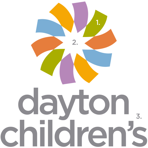
logo mark
As the Dayton Children’s logo is new to the marketplace, it requires a consistent and controlled application to all of our community-facing materials and services. The logo, for our reference, will be known as the logo mark. Its primary purpose is for use on stationery, marketing/corporate collateral, uniforms, signage and promotional items.
The logo mark is the primary visual identity device which conveys the ownership of, and responsibility for, all Dayton Children’s properties, functions, services and personnel.
The correct usage of this logo mark helps to promote and reinforce brand identity while at the same time build brand equity.
The Dayton Children’s logo mark is always used alone. It is never combined with any descriptive identifiers, although there are acceptable uses in combination with approved organizations and partner companies. See examples, in partner logos section. The logo mark may not be altered or modified in any way. Our logo mark has two essential parts: the whirligig and the word mark. Tampering or altering the logo mark jeopardizes our ability to protect it from legal infringement.
A stylized and custom-designed whirligig symbol creates a strong and memorable focal point next to the custom word mark used to represent the name “Dayton Children’s.” The letters and spacing of the word mark have been uniquely crafted, along with the use of all lower case type and its position and proportion to the whirligig symbol. The elements of this logo mark, or their relative proportion must not be altered or reconfigured. The whirligig symbol should not be used separately from, or in place of, the entire logo mark.
Special circumstances may occur such as a favicon or super graphic. If an exceptional case arises, please email brandteam@childrensdayton.org.

- The ribbons represent the many members of the community that it takes to care for a child. The vibrant colors represent the variety of services we provide, the diversity of the patient population we serve and the bright future we think all kids deserve.
- The white star within the center of our logo reminds us that each child we care for is our singular focus. The 10 points of the star represent our goal to always strive for a “perfect 10” in patient care.
- The lower case font illustrates how we address items at a child’s level and demonstrates our humility in being a community-supported health care system.

